Hybrid Mobile App & Nurse Service
I led the zero-to-one process from discovery to post-launch for this service. My challenge wasn’t just to design an app, but to architect and launch an entire system from first principles. This case study highlights just one aspect of motivating and getting patients to track medication and symptom data between their 6 month visits through a mobile app.
Project
0-to-1
Role
Founding Designer
Year
2019-2021
Scope
Product Design
User Research
Service Design
THE ASK
Octave Bioscience is a healthcare startup whose aim is to improve patient outcomes by shifting Multiple Sclerosis (MS) management from a trial-and-error approach to a more objective data-based approach.
This was their first offering and the initial step was to get MS data by providing a service for both MS Patients and their Neurologists, in a mutually beneficial exchange of service for their data. We had to provide value for both user types: neurologists, for patient recruitment and their patients, who provided MS data.
BUSINESS CONTEXT
Design a service to get MS Patients to track critical data between their 6 months visits so as to share with their neurologist at their visit for informed decision making.
Outcomes
I worked with the founders to workshop and explore solutions to problems and translated their vision with a visual designer into flows and screens for development that was launched to the App Store and the Play Store for use at select MS Centers.
It was heartening that our work had a great impact on people living with an incurable disease who responded with excitement and enthusiasm and to be also be recognized for our efforts by the design community.
USER RETENTION
92%
of patients taking at least 8+ actions in the app per week after 6 mths
NEUROLOGIST FEEDBACK
+43%
increase in confidence when making decisions with patient at the visit


Research
I had to design for 2 user types: neurologists who would consume the data and patients who would provide the data.
I interviewed neurologists first to identify which data was most critical for treatment decisions, then spoke with patients to understand how they were currently tracking those critical data.
NEUROLOGIST
What types of data do they need from their patients to make informed decisions at the visit?
What were the challenges in the data that their patients were currently tracking for their visit?
PATIENT
Were they tracking those critical data? And what methods and tools were they using to do it?
What were the friction points or gaps in current solutions that made it more challenging?
NEUROLOGIST INSIGHTS
“I just need actionable data: medication tracking and symptom changes.”
MS symptom changes may mean that the MS meds were no longer effective but this was in combination of knowing they were taking it as prescribed.
“Some of my patients don’t track or remember at all, but I have to ask.”
Neurologists need to know of symptom changes in the past 6 months to make treatment decisions and precious time in the 30 min visit was being wasted.
PATIENT INSIGHTS
“I use my phone alarm, post-its, notebook for reminders and tracking.”
Patients were using makeshift tools and generic tracking apps but the piecemeal approach prevented a holistic view useful for patients and neurologists.
“I’m not sure how much detail I should be tracking between visits.”
There was no standard method of tracking and patients were tracking with too much or too little detail, resulting in unusable data and wasted effort.
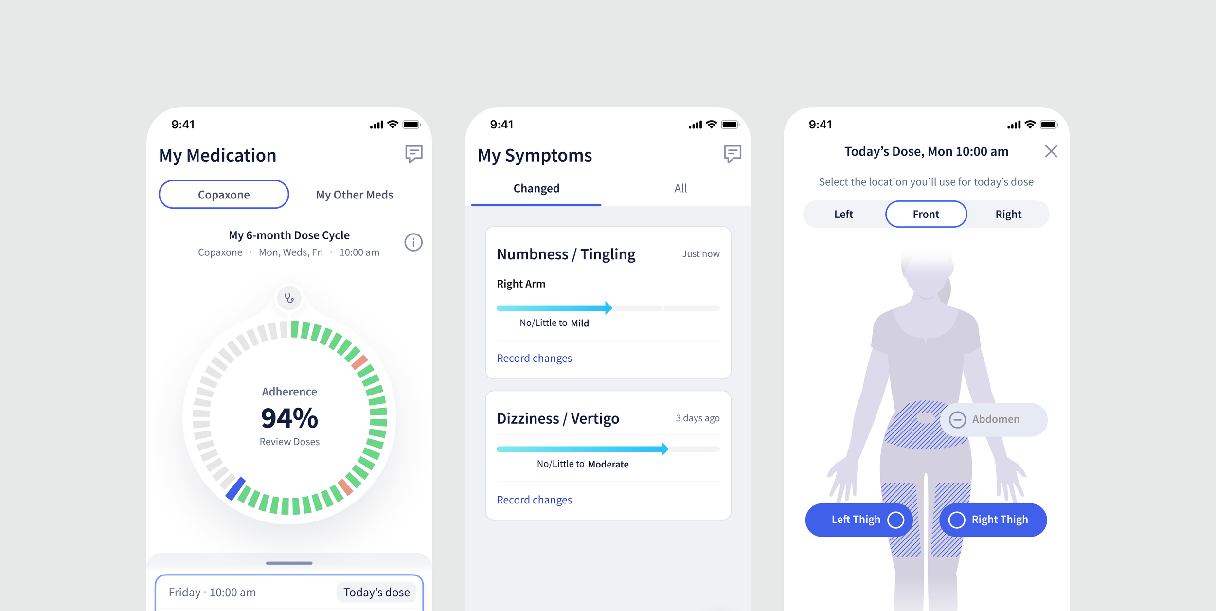
1 Medication Tracking
2 Symptom Tracking
3 Patient Report for Neurologist
We identified patients who were on injectables as our beachhead user as they had more need of a tracking solution. The challenge was to provide value to motivate them to move over to our solution and to keep tracking.
Adding Value while Keeping Medication Tracking Simple
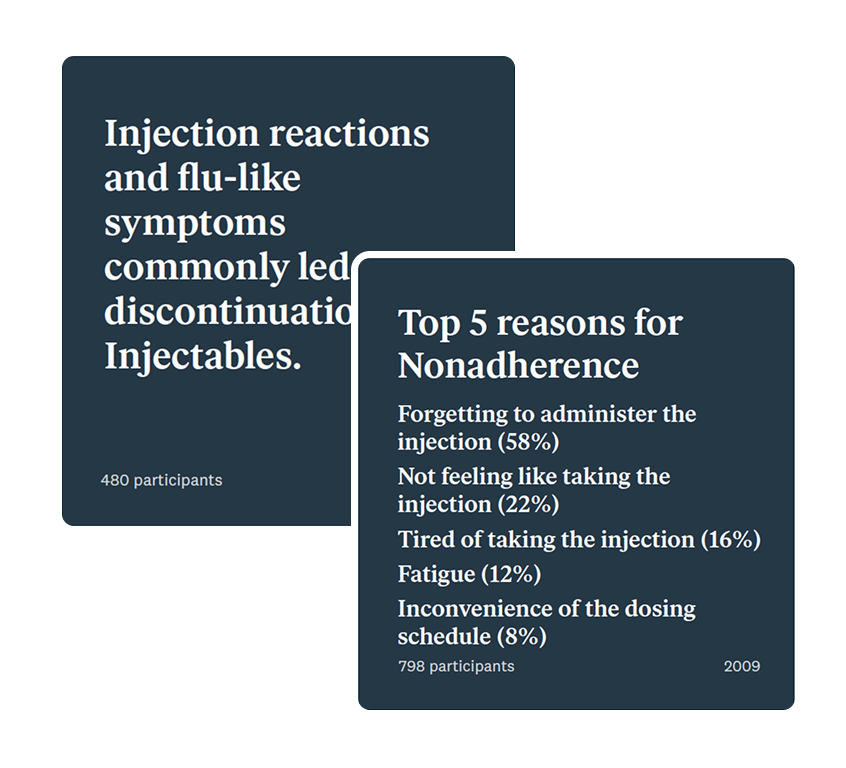
Working at an early-stage startup with limited MS expertise, I researched medical journals and learned that injection site rotation was critical to prevent reactions—the primary reason patients discontinued their medication.
Existing injection trackers from drug companies were difficult to use that failed to integrate with patients’ busy lives. I designed an experience that addressed these gaps and outperformed existing alternatives.
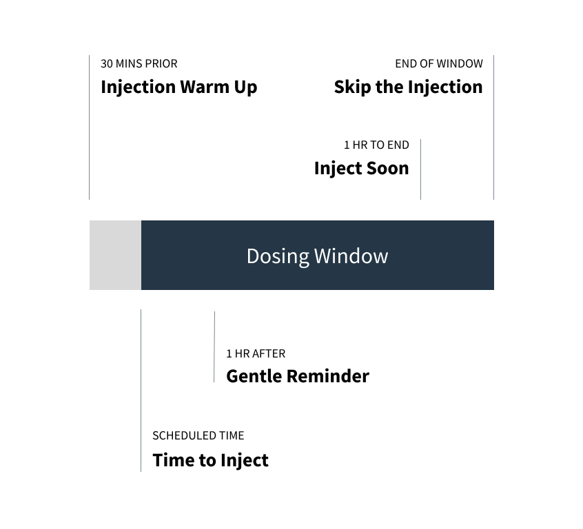
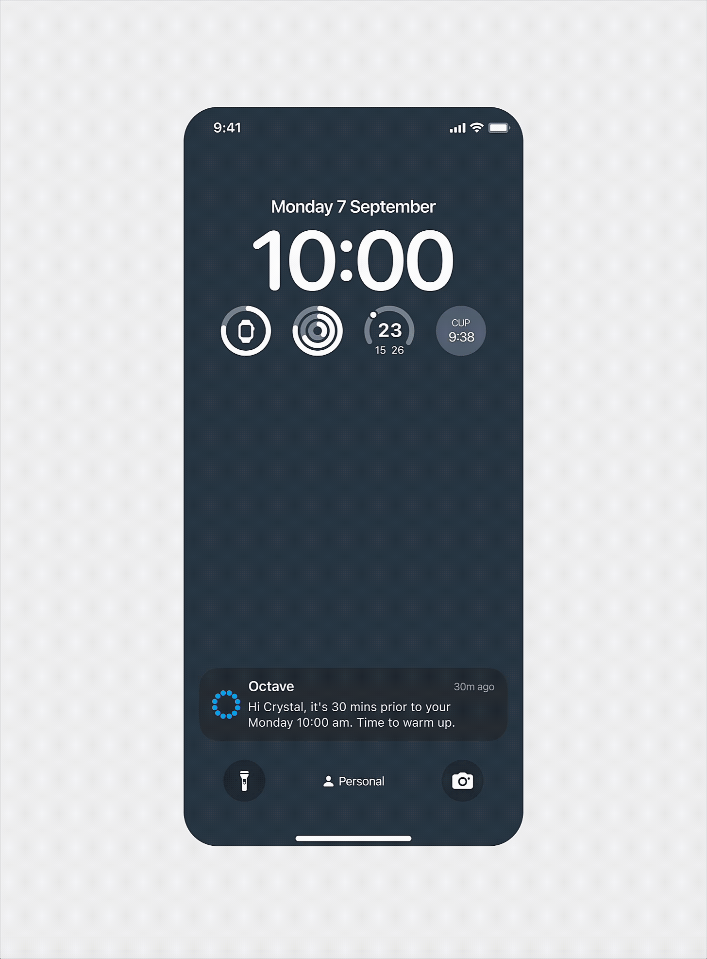
To do better than the phone alarm, I designed staged reminders tied to the injection flow, including warming the meds, at dose time, etc to help patients.
From medical journals, I learned that injection reactions were caused by overuse of injection locations so I highlighted recent locations to prevent it.
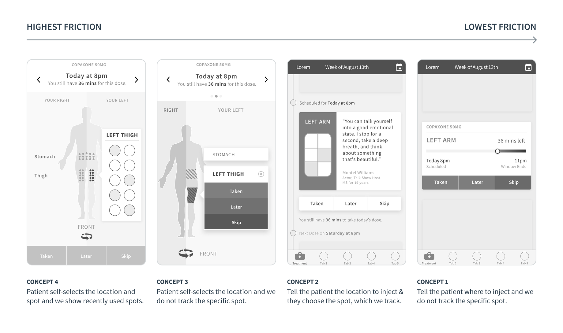
Our underlying goal was to collect more data for the MS Data Repository so there was always a temptation to ask for more. I balanced 3 lenses of patient choice, useful data, and friction level to keep things simple for the patient.
Helping Patients in Subtle Ways in the Medication Tracking Flow
App Reminders with Privacy
Patients were concerned with others knowing about their MS but desired reminders so I used ‘obscured’ content where it would not be clear to others, just the patients.
Recently Used Locations
To prevent overuse of injection locations, I showed where they had recently used to encourage spreading them out while trying to make sure patients shared the truth.
From a Lifetime to just the Next Visit
Unlike diseases that you can ‘beat’ or that have a defined timeframe like months, MS lasts a lifetime. Users shared about moments where they gave up when that inevitability hit them but then got back on their feet again and again.
I wanted to help users think about their tracking in smaller chunks of time to make it feel more manageable and provide an opportunity to ‘restart’ if things spiraled in a period of their life.
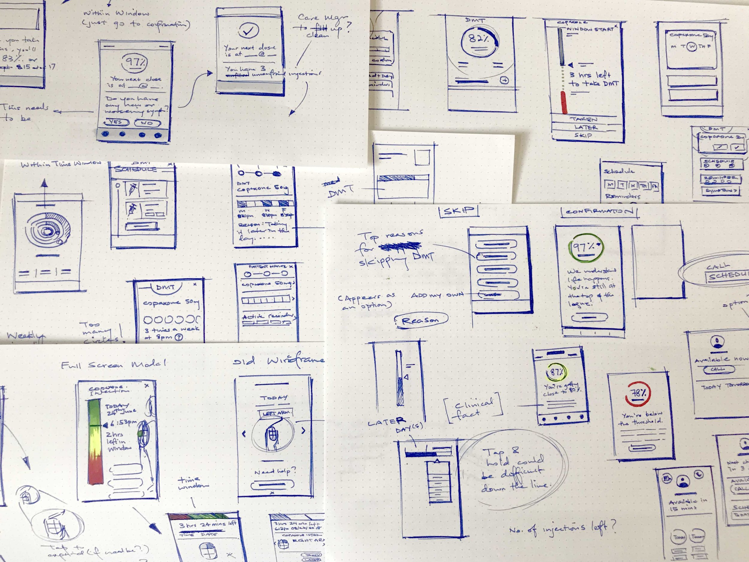
Started with sketching to explore broadly and arrived at the concept of cycles with the neurologist visit being the start and end of the cycle.
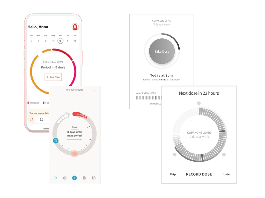
Recognizing similarities with lifelong fertility cycles, I drew inspiration from fertility apps with the concept of a circle to review and track their doses.
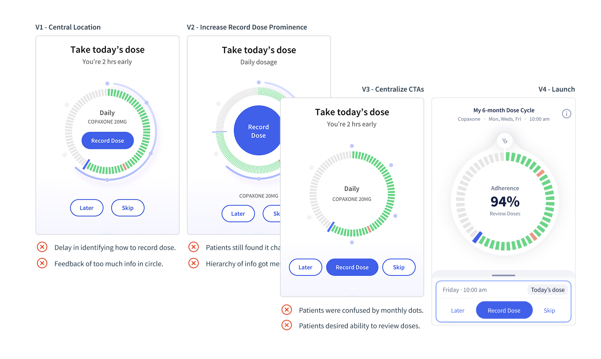
Insights from user testing that I conducted helped fine-tune interactions, refine layout logic, turning the Dose Cycle, a place for patients to review and track progress till their next visit into a clear and intuitive tool.
Dose Cycle to review and record their injections
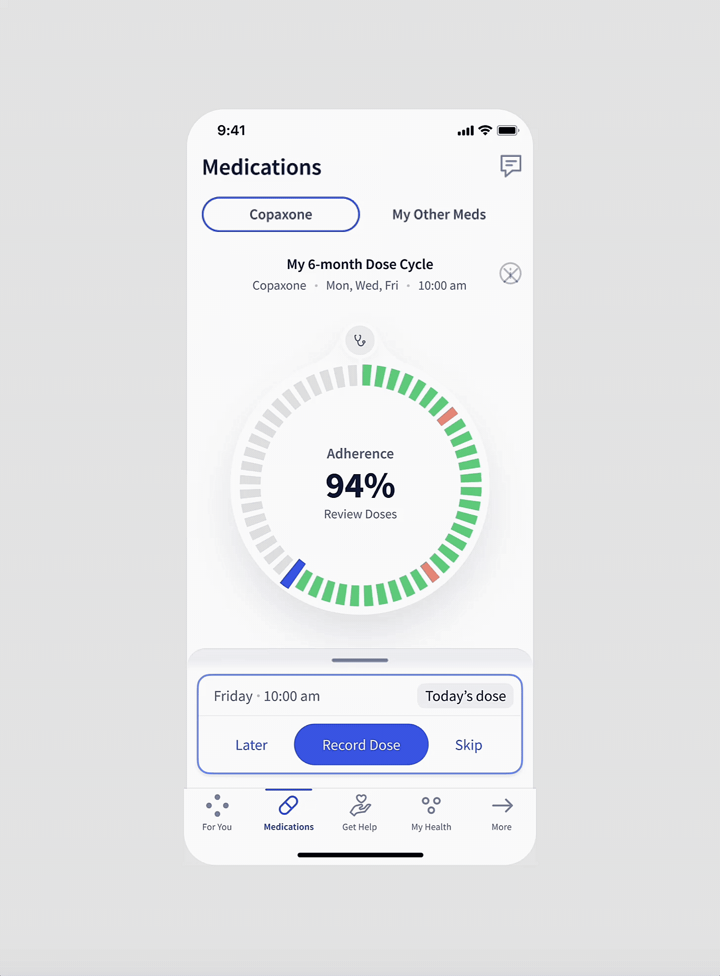
The dose cycle would automatically calculate the number of doses between their visits and provide a visual indicator of how they were doing. Patients can review their past doses to ensure it was correct or remind themselves why they may have skipped an injection.
1 Medication Tracking
2 Symptom Tracking
3 Patient Report for Neurologist
We were competing against generic symptom trackers and notepads so we had to show how our App clearly differentiated through its focus on serving MS patients exclusively and providing value for the unique concerns and needs that they had.
Actionable Advice based on Patient Input
I learned that patients were unsure what to do when they experienced symptom changes between visits, and that different symptoms and severities called for very different responses, from “wait 24 hours” to “go to the ER.”
With no standard MS symptom and severity list, I took ownership by co-creating it with three neurologists. I then translated it into flowcharts, logic, and requirements for developers to implement accurately and quickly.
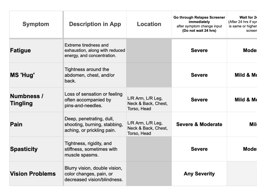
Co-created the MS symptom list with severity hierarchy and the key input needed: symptom, severity, duration and location (e.g. numbness).
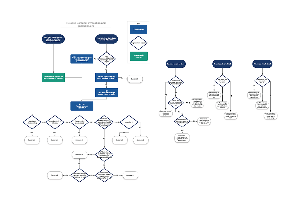
Combined with the symptom list, I served as the PM and translated it into a flowchart for development to create an algorithm for actionable advice.
This was done in balance with the patient experience so that they did not feel overwhelmed with the number of questions, screens, and options. I kept curating the flow while ensuring the app’s advice was medically sound through the experts.
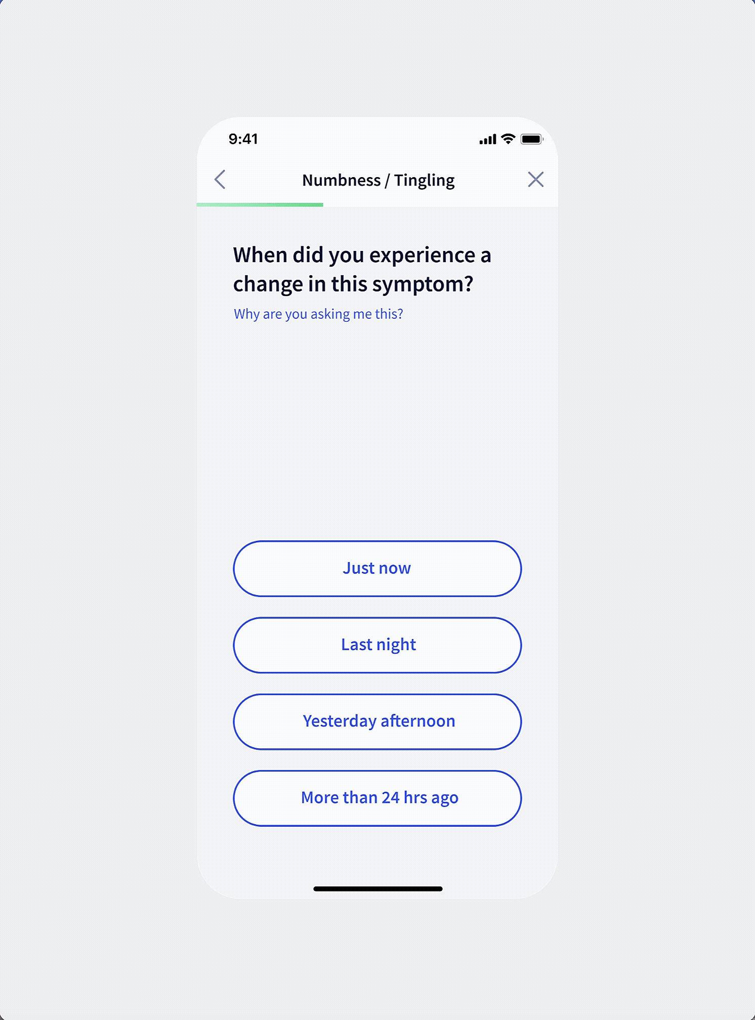
Actionable Advice with Symptom Input Flow
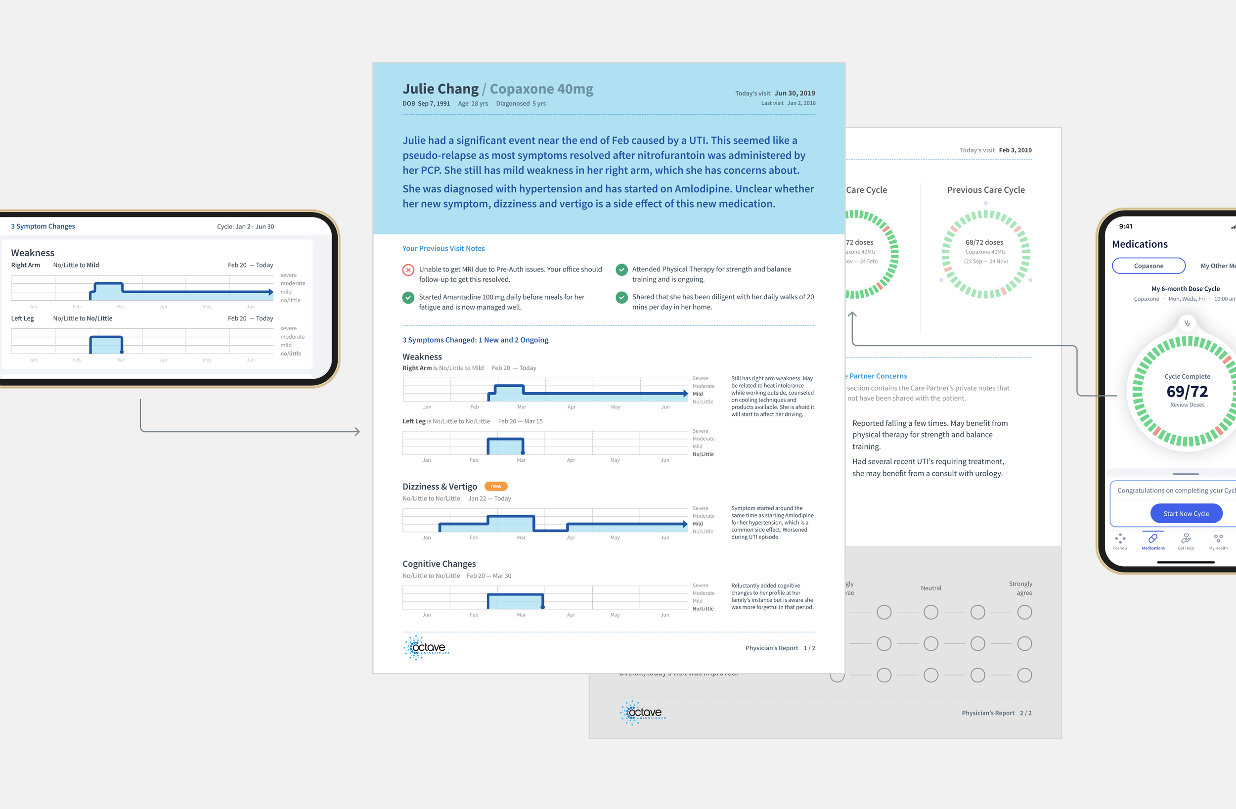
This shows an example of a patient providing a mild symptom change where they are given actionable advice to wait 24 hours as that is what their neurologist would tell them too but to monitor and update if things change.
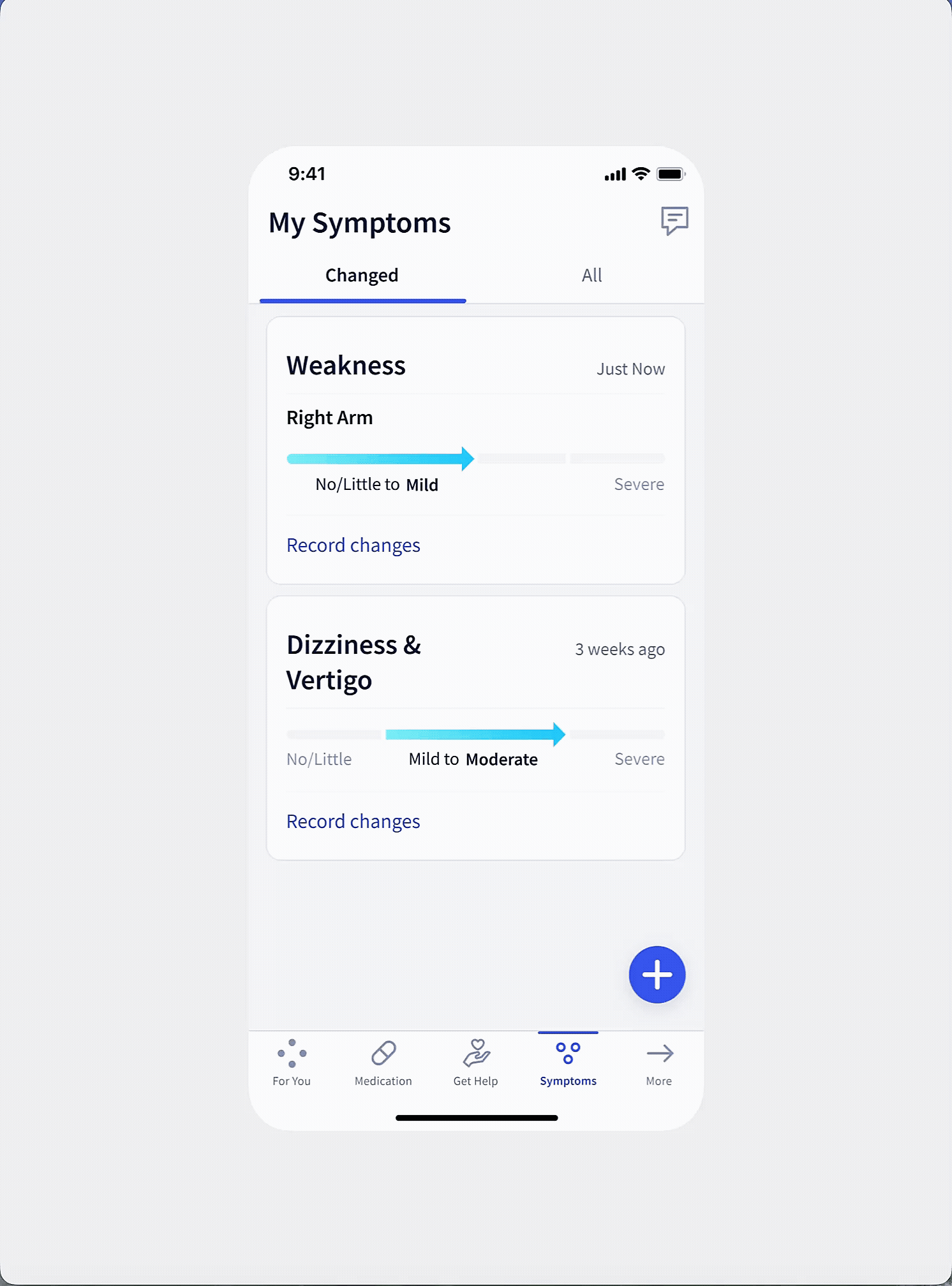
Single Source of Truth for their Symptoms
Cognitive decline such as worsening memory was common among MS Patients and the fear of losing themself to the disease came up in user interviews.
Patients got really excited when talking about seeing all of their current and previous MS symptoms in one place. It could serve as a primary motivator to keep tracking their symptom changes.
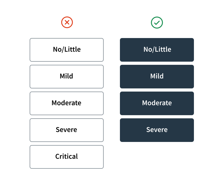
Neurologists preferred 5 severity levels for subtle changes but patients found it hard to choose so I reduced it to 4 levels, as patients were tracking.
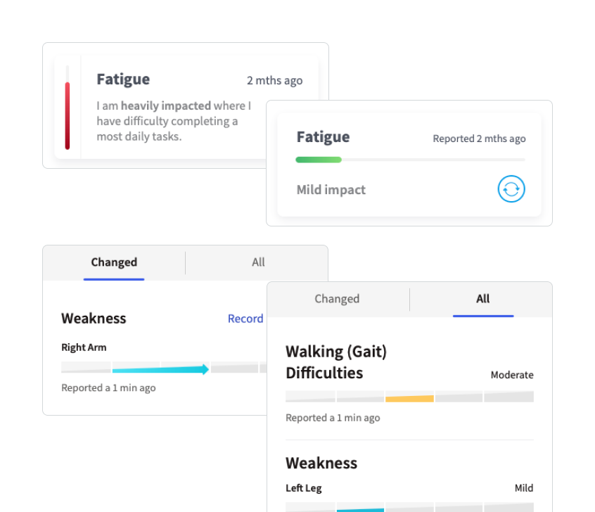
Made the exception to include their lifetime of symptoms as it motivated patients to track. We could get the data from their neurologist.
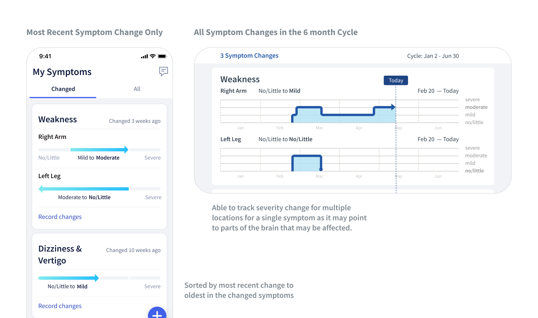
To design for the constraint of the phone size, I enabled patients to view the most recent severity change in portrait mode and all 6 month severity level changes in landscape mode.
Symptom Changes in this Cycle and in their Lifetime, all in a Single Place
This shows how patients can see the symptom changes they have recorded between their visits while also being able to review all of their past symptoms that we would get from their EHR and during their onboarding process.
1 Medication Tracking
2 Symptom Tracking
3 Patient Report for Neurologist
We needed all the medication and symptom data that patients had invested effort in tracking over the 6 months to be actively used by the neurologist in their visit to see that all the tracking was worth it.
Connection between the Patient App and the Patient Report
As Neurologists were our primary method of patient recruitment, we also needed to show the value of our service to them.
At the same time, I wanted to show the patients the connection between the tracking in the app and the data used in the patient report for their visit to motivate them to track for the next 6 months.
We decided to use a paper report first to make sure we were providing the right data before moving into integrating with their EHR.
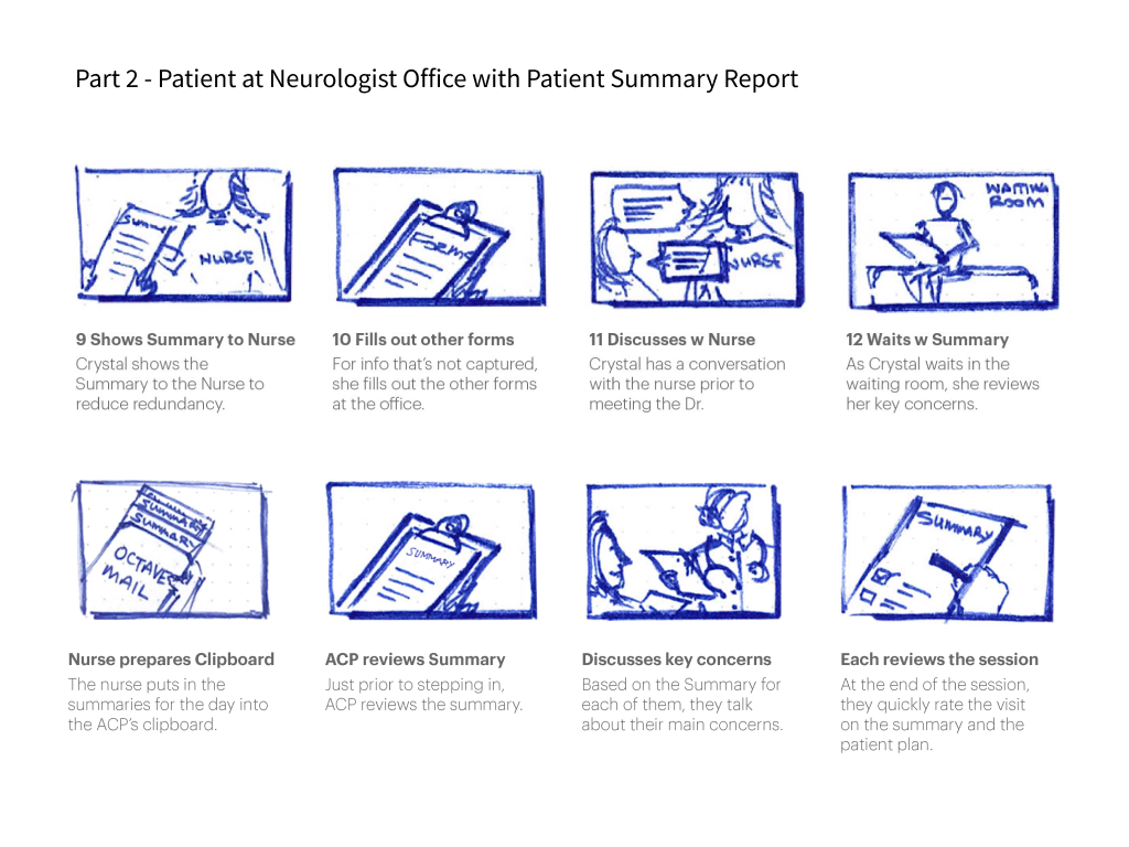
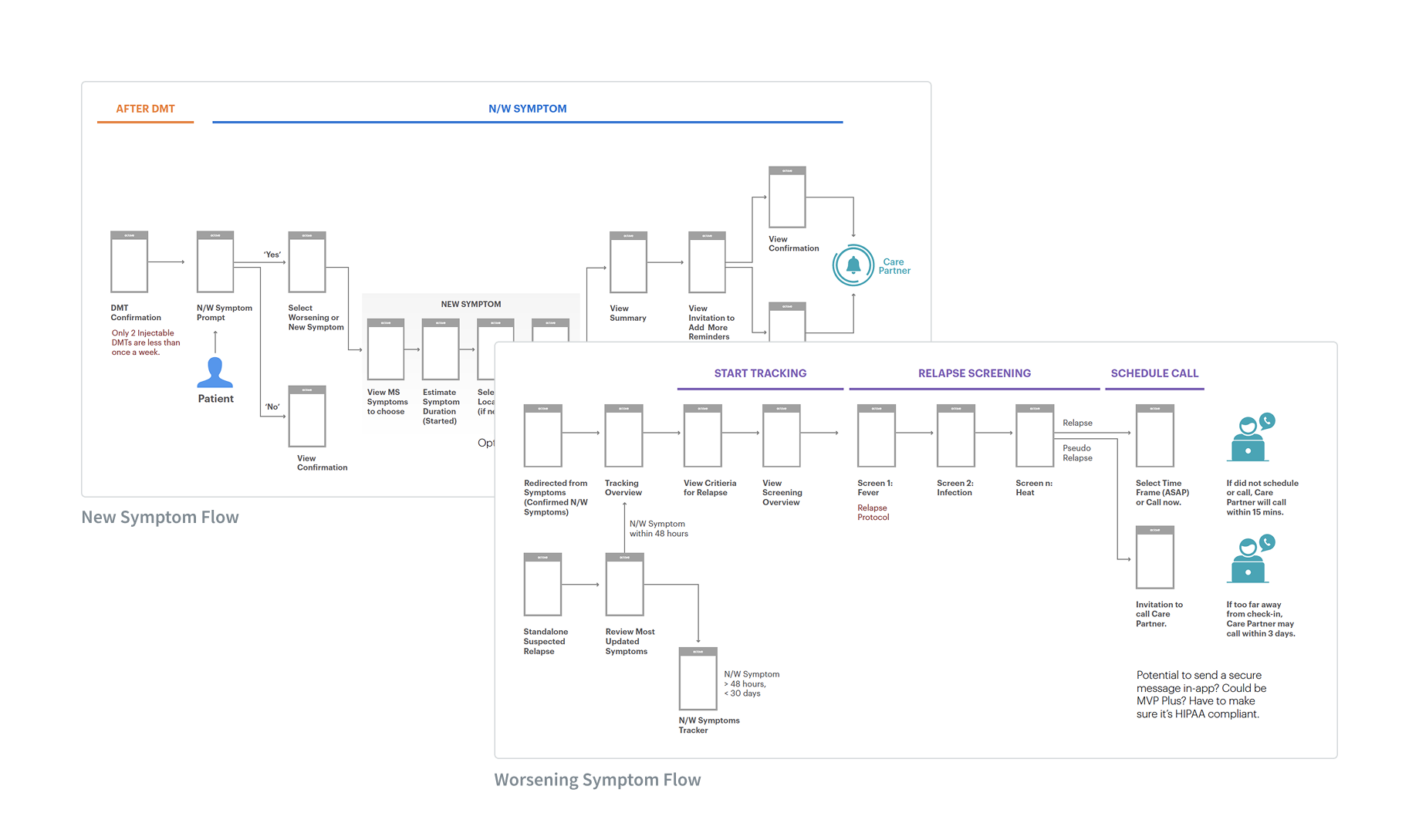
Using quick storyboards, I aligned the team on the key moments and backstage logistics to ensure the report would be used in the exam room.
To show how the data would surface in the report from the self-service app and the nurse service, I co-created a service blueprint to get team alignment.
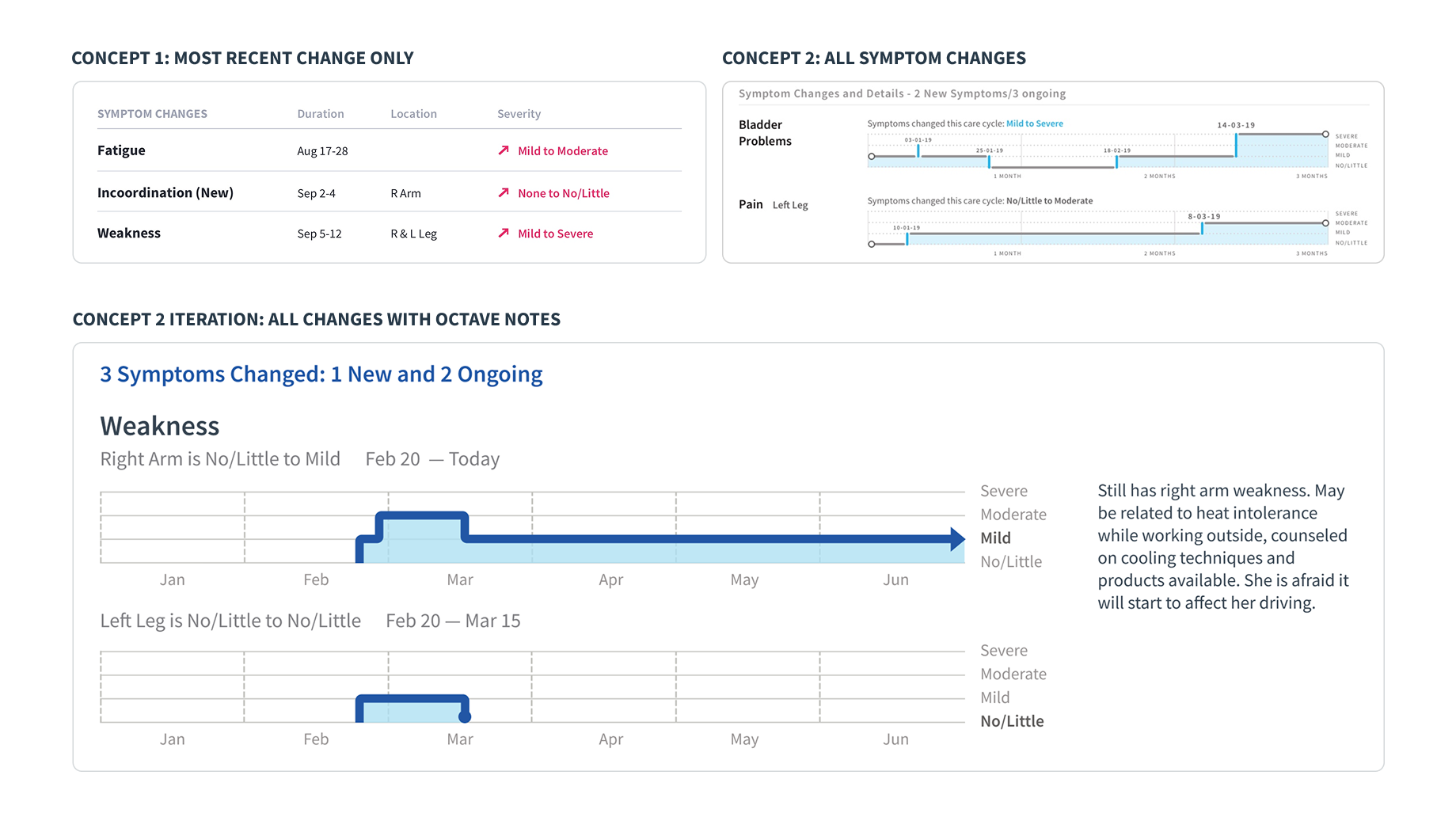
As I was designing the summary report while designing the app. I tested different options for the level of detail for symptoms and made the decision to make both the app and report components identical.
Shared Components between Patient Summary Report and Patient App
The data components from the patient app were used almost as-is into the patient report for the neurologist. This was useful not only for the patient who could directly connect their efforts to the report but made it easier for development to build. Other components in the report are filled in by the Octave Nurse.
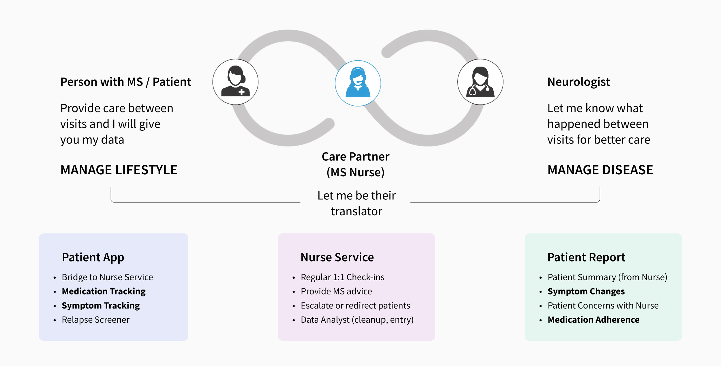
Snippet of the Octave Ecosystem that I designed
This case study highlights one aspect of the broader system I designed. Beyond the tracking, I designed the MS Nurse service model, defining how nurses provide value, how the app enables communication and coordination for monthly check-ins, and what happens during those sessions.
Learnings & Takeaways
The design process wasn’t linear. It required constantly zooming in and out, focusing intently on one part of the system, then stepping back to understand how another piece needed to work. Conversations with neurologists revealed gaps that changed the approach to patient-facing features. This back-and-forth between different parts of the system was essential but uncomfortable, requiring comfort with ambiguity.
What made this particularly challenging was that everything had to work together from launch. Success meant going deep on individual touchpoints while never losing sight of the connections, hand-offs, and in-between moments that made the whole system function.
Navigate Ambiguity by Focusing and Unfocusing
I initially focused on the patient app, but once the medication tracking flow was ready for development, I stepped back and shifted to designing the neurologist-facing patient report. Working closely with neurologists, I learned what they actually needed for patients’ symptoms and then returned to the app to design the symptom tracking experience.
Think in Systems, Execute Touchpoint by Touchpoint
Octave was unusual because the product had to work as a unified system from day one: patient app, neurologist report, nurse service, and nurse portal. It was crucial to go deep on the app experience while also deliberately designing the hand‑offs and “in‑between” moments so none of those connections were overlooked in the larger care ecosystem.
Other Projects
Healthcare • 0–to–1 • Report Design • B2B
Creating the First Iteration of a Volumetric MRI Report in 6 weeks
Data Storage • Dashboard • B2B
Unifying SMB Products into an Enterprise Storage Platform

Human Resources • Service Design • B2B